
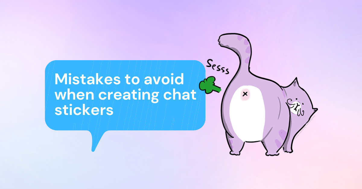
Mistakes to avoid when creating chat stickers
Creating chat stickers is no easy task. As a sticker creator, you need to find the perfect balance between design and making your stickers usable on different chat platforms. Juggling both duties is not simple, and it can lead to certain mistakes. Today, we’ll go through some of the top mistakes you should avoid when designing and uploading sticker packs. Let’s dive into it!
What to avoid when designing chat stickers:
1. Sticker designs that are not dark mode friendly
One of the most common mistakes sticker creators make is not designing stickers visible in dark mode chats. Since most users use light mode themes in apps, many creators forget to design their stickers for applications with darker backgrounds. The result is dark colors on top of dark colors which makes many stickers not visible!
To solve this problem, you can add white outlines to both sticker characters and captions. This will make stickers visible in both light and dark mode platforms!
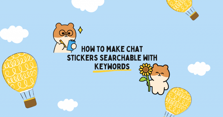
2. No searchable keywords
Another common mistake is the lack of keywords in sticker packs. As explained in our previous post, “How to make chat stickers searchable with keywords,” keywords help make sticker packs searchable to users. Adding words that best describe the sticker pack theme and characters is vital for better searchability.
At Stipop, creators can add keywords to their packs as a whole. We usually suggest writing keywords that best answer the following topics:
- Pack name
- Character name
- Character type – is your character a dog? a baby? a tomato?
- Pack theme – is your pack is about summer? fall season?
- Aura – is your sticker pack full of funny stickers? or super cute designs
- Action – are your stickers dancing? jumping? laughing?
3. Easily outdated expressions
Another mistake to avoid is adding expressions bounded on a trend or a specific date to stickers. For instance, imagine a sticker pack that focuses on celebrating the new year. No matter the year, the new year is always a celebration. However, sticker packs with year-specific captions (e.g., “happy new 2021!”) can only be used once in a lifetime. The same thing applies to trendy slang words. Sure, they will perform well for a while, but as trends go, your stickers will eventually lose the appeal that speaks to users. Thus, to increase your stickers’ usability, you should remove expressions that can be easily outdated.
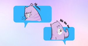
4. Long and too specific captions
Stickers are all about expressing how you feel. Captions help express these emotions better and save time texting. However, overly long and specific captions make stickers less appealing to use.
When adding captions to your stickers, make sure to make them short and concise. Include general words that users use daily (e.g., good morning, good night, yes, no, I don’t know, lol,….) and don’t go overboard with the text! The goal is to make captions that users can often use, regardless of the time of the year.
5. Fonts that are difficult to read
If you use text in your stickers, choosing a font that is easy to read is crucial. This task is not always easy to accomplish, and many creators pick fonts that are too elaborate for the eye.
To prevent this from happening, you should use more classical font styles that complement the sticker design and deliver the message in a readable and appealing way!
____________
Are you a creator?
Looking to grow your audience? Stipop is the perfect place for you. With more than 5,000 sticker creators and 200M end-users worldwide, Stipop elevates all types of creators to a wider audience of sticker fans. To learn more about becoming a sticker creator at Stipop, visit our Studio page. To stay on top of new stories and community updates, make sure to visit Studio blog!